Choosing the Best Colors for Your Brand: A Complete Guide
Are you a consultant, coach, thought leader, author, or podcaster looking to create a powerful, visually appealing personal brand?
Your brand colors matter—they influence how your audience perceives you, how confident you look on camera, and even how you stand out online.
In this guide, I’ll break down:
✔ How to find the colors that flatter you best
✔ What different colors say about your brand personality
✔ How to strategically choose your main, secondary, and accent colors
Let’s get started!
Step 1: Find the Colors That Flatter YOU Best
Before choosing your brand colors, start with the colors that look great on YOU—the ones that enhance your skin tone, make your eyes pop, and help you shine on camera.
The Four Seasonal Color Palettes
Use this quick guide to determine which category fits you best:
1. Winter (Cool & Bold)
- Dominant among 75% of the world’s population!
- Common for people with distinctive features (deep skin tones, high contrast between hair and eyes).
- Colors: Jewel tones like cobalt blue, emerald green, deep red, and royal purple.

2. Summer (Cool & Soft)
- Ideal for fair-skinned people with cool undertones (blue or rosy).
- Colors: Soft blues, grays, dusty pinks, and muted pastels.

3. Spring (Warm & Bright)
- Great for those with golden undertones, freckles, or a natural glow.
- Colors: Corals, warm pinks, fresh greens, and golden yellows.

4. Fall (Warm & Earthy)
- Best for people with bronze or golden undertones, hazel eyes, and rich hair highlights.
- Colors: Olive greens, mustard yellows, burnt oranges, and warm browns.

PRO TIP: Hold different colors up to your face in a mirror. Which shades make your skin glow and which ones wash you out? Your best shades should make your eyes pop, teeth look brighter, and complexion look fresh!
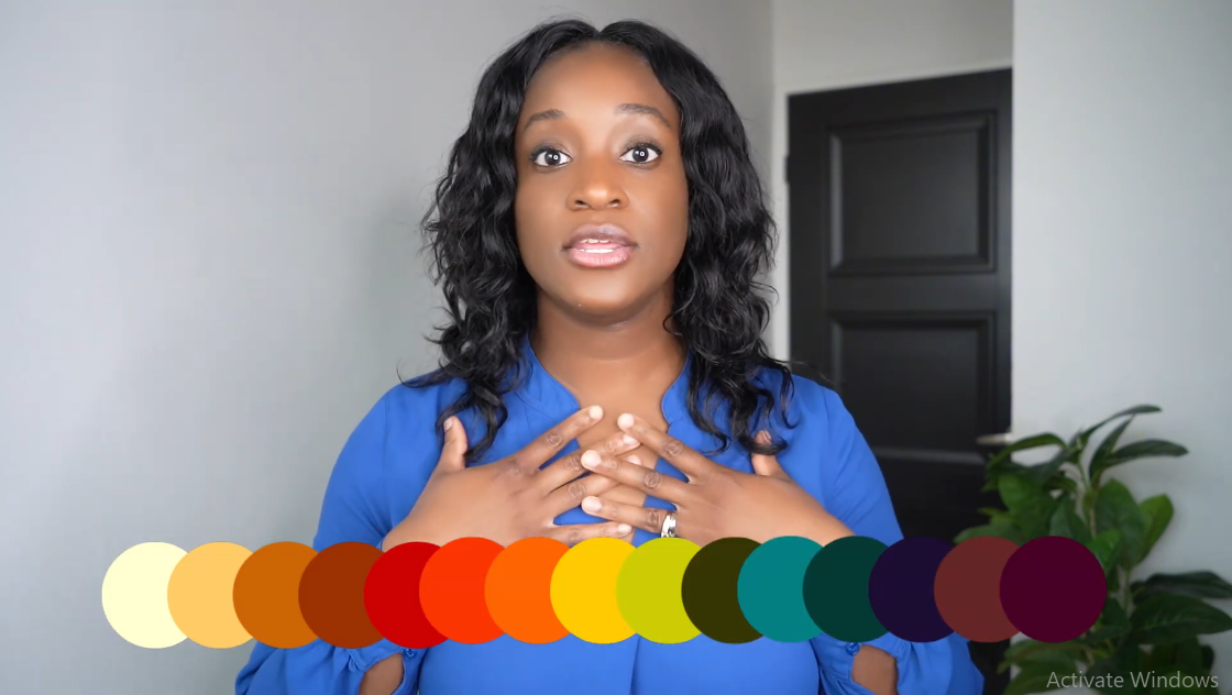
Step 2: Align Your Colors With Your Brand Personality
Your brand should look like you AND feel like you. The colors you choose communicate emotions, energy, and personality.
What Your Brand Colors Say About You
Red – Bold, Powerful, and Attention-Grabbing
✔ Communicates leadership, passion, strength, and courage
✔ Ideal for coaches, public speakers, or bold thought leaders
✔ Works best as an accent color unless you’re going for high energy

Orange – Creative, Playful, and Energetic
✔ Shows innovation, enthusiasm, and fun
✔ Perfect for creatives, podcasters, and personal brands with a vibrant spirit
✔ Great as an accent color to grab attention

Yellow: Happy, Optimistic, Inspiring
✔ Evokes positivity, energy, and confidence
✔ Great for brands that want to be seen as uplifting and joyful
✔ Often used as an accent color

Green – Trustworthy, Grounded, and Peaceful
✔ Symbolizes wellness, authenticity, and financial success
✔ A top choice for wellness coaches, entrepreneurs, and consultants
✔ Works in all shades, from deep emerald to soft teal

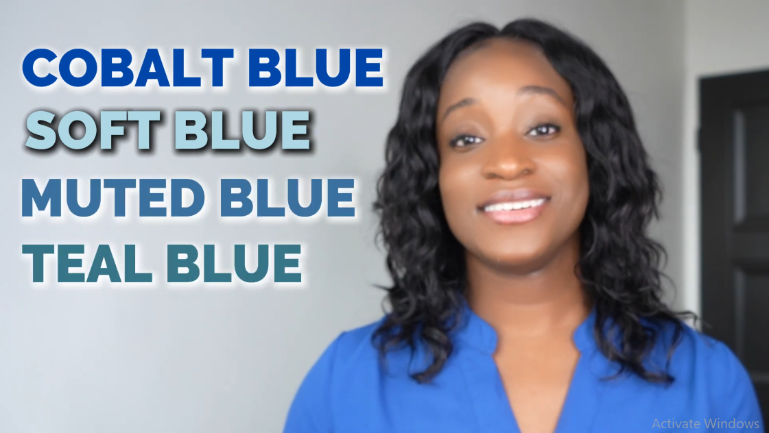
Blue – Professional, Intelligent, and Reliable
✔ Associated with trust, success, and credibility
✔ Perfect for business consultants, corporate brands, and industry experts
✔ Cobalt blue is ideal for a strong presence
Purple – Luxury, Wisdom, and Spirituality
✔ A great choice for coaches, spiritual leaders, and premium brands
✔ Darker purples = Luxury & high-end services
✔ Magenta and pinkish purples = Fun, feminine, and approachable

Pink – Feminine, Empowering, and Playful
✔ A popular choice for women’s empowerment brands
✔ Works well as an accent color in personal branding
✔ Magenta = Bold & energetic | Soft pink = Calm & nurturing

Brown – Grounded, Authentic, and Warm
✔ Represents stability, reliability, and warmth
✔ Common in wellness, holistic, and rustic brands
✔ Less attention-grabbing, but great for an organic, down-to-earth feel
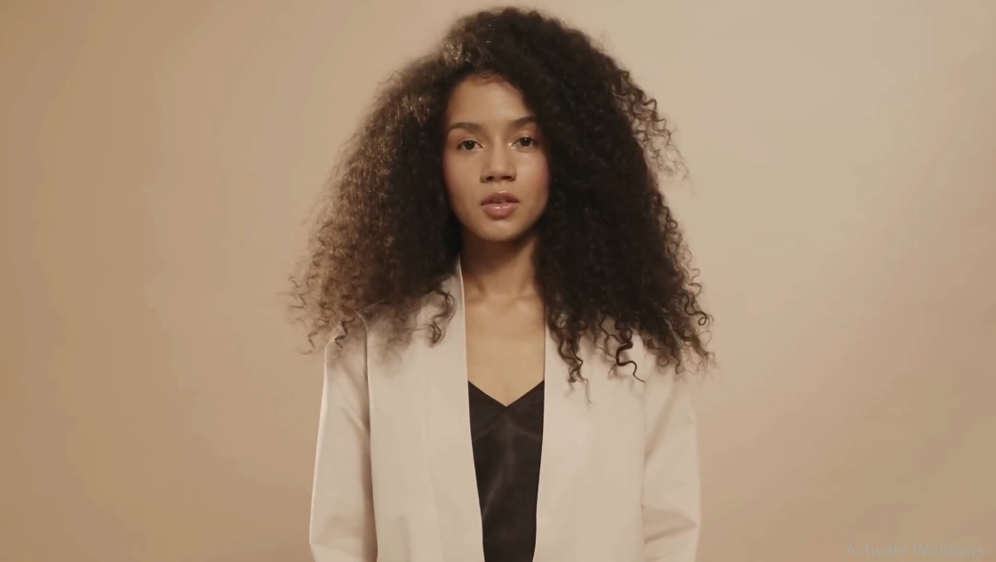
Black – Sophisticated, Bold, and Mysterious
✔ Luxury, exclusivity, and high-end branding
✔ Used for powerful, sleek brands
✔ Works well as a main or accent color

White – Pure, Clean, and Minimalist
✔ Conveys clarity, simplicity, and openness
✔ Works best as a background color for readability

Gray – Professional, Balanced, and Neutral
✔ A modern, minimalist choice for corporate or business brands
✔ Works well with masculine and sleek designs
✔ Lighter grays = approachable | Darker grays = more serious

Step 3: Choosing Your Brand’s Main, Secondary & Accent Colors
Now that you know your best personal colors and how they reflect your brand’s personality, it’s time to choose your:
Main Color – The dominant color of your brand (should complement your skin tone!)
Secondary Color – Supports the main color and adds depth

Accent Color – Draws attention & adds contrast
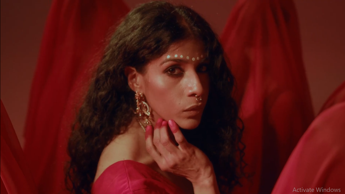
Pro Tip: Stick to 2-4 colors to keep your brand polished and professional.
Ready to Elevate Your Brand with the Right Colors?
Choosing the right colors for your brand is more than just looking good online—it’s about confidence, credibility, and connection with your audience.
Want help refining your brand colors, style, and identity?
Need a photoshoot, website refresh, or a total brand makeover?
Let’s bring your brand to life!
Visit personalbrandboss.com to get started today!
Try out different colors, experiment with your palette, and own your brand identity like a pro!
Drop a comment below with your brand colors and how they reflect your personality!
Follow for more branding tips to make your brand shine!
Let’s make your brand visually powerful, memorable, and authentically YOU!

What's Your Client Attraction Factor?
Take this quiz to discover how to captivate your ideal clients. Answer 30 insightful questions in 3 minutes to receive a personalized report with actionable insights tailored to your business. This is more than just another quiz – it's a strategic tool to transform how you attract clients.

